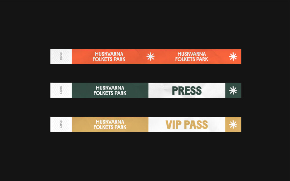
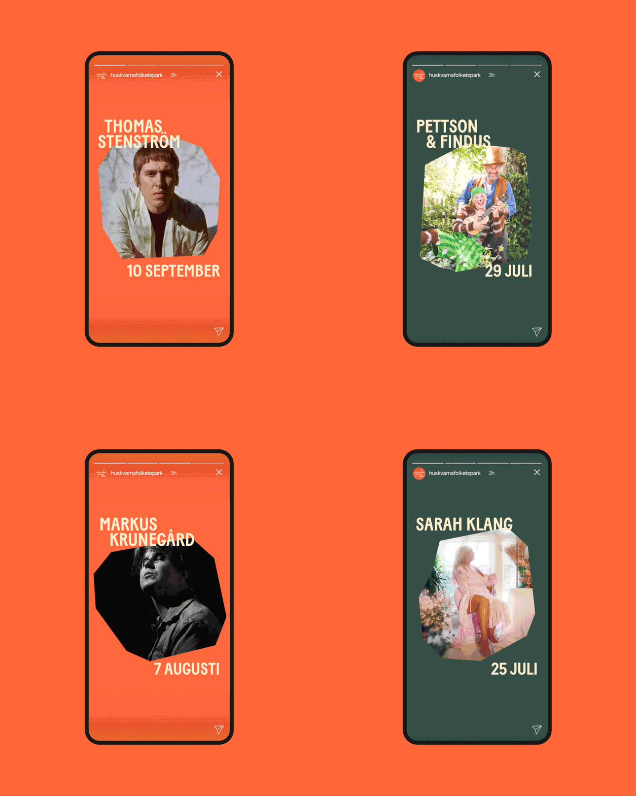
Identity for Huskvarna Folkets Park
The main focus was to create a visual extension of the venue that would appeal a broad target group. Inspiration for the identity comes from the history, architecture and land marks. Backstage, there are walls covered in posters from the opening in the 1920’s until today, I was intrigued by the eclectic typography and the analouge cut out collages which inspired the aesthetic of this identity.
Client
Huskvarna Folkets ParkCreative Field
Graphic DesignProject Type
Logotype, Visual Identity DesignTechnique
Digital, Vector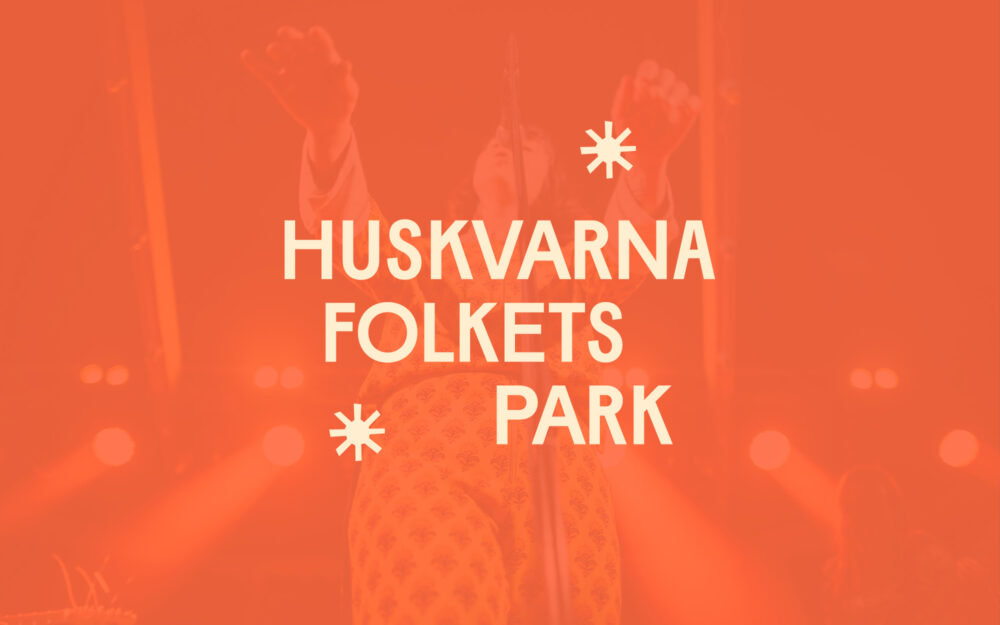
The logo is inspired by landmarks found at the site
An illustration style that goes hand in hand with the logo.
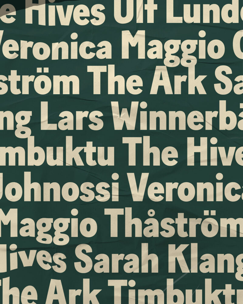
The typography is quirky and bold, suitable for a variety of use
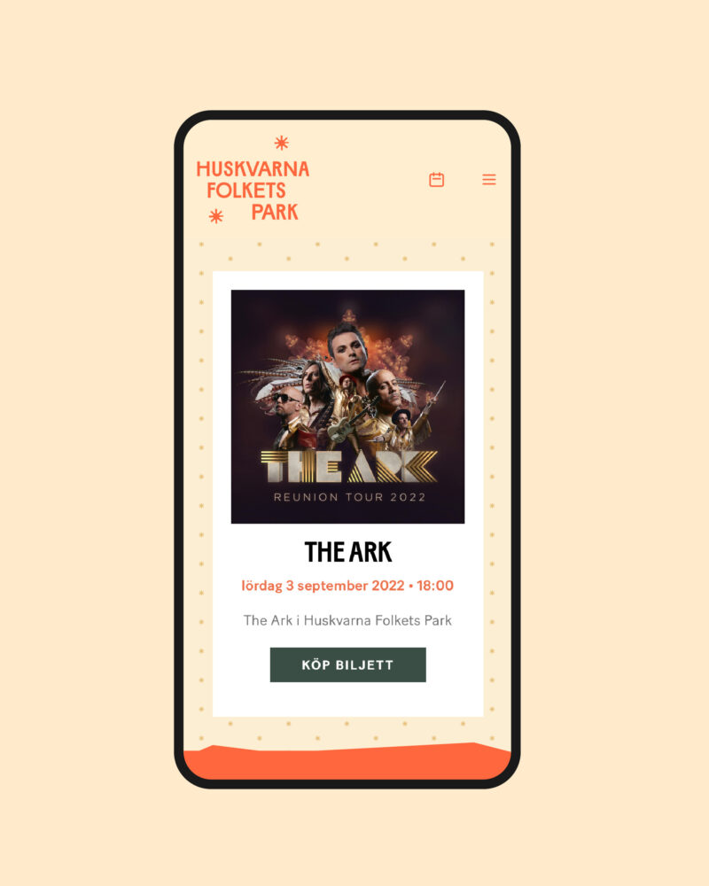
Implementation of the identity on the website
