Logo Gunnaräng riding facility
The client was looking for a classic, long-term and inclusive logo, which I took as a starting point. The logo’s horse is free. With a lack of equipment, I wanted to show that the central thing at Gunnaräng is the shared interest in horses, not the choice of branch.
Client
GunnarängCreative Field
Graphic DesignProject Type
Logotype, Visual Identity DesignTechnique
Digital
Logo Gunnaräng riding facility
Logo Gunnaräng riding facility
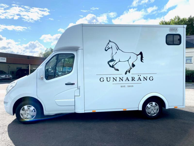
Logotype on horse transport
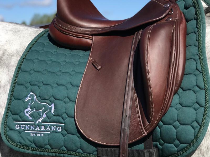
embroidered logo
