General program Swedish Chamber Orchestra
An assignment where I had to combine illustration and graphic design. The form of the Swedish Chamber Orchestra’s material is familiar to the people of Örebro, but the illustrations gave the catalog a more unique and bold expression. A good grip when updating a campaign, or why not when launching a new product.
Client
Svenska KammarorkesternCreative Field
Graphic DesignProject Type
Advertisement, Information Material/PublicationsTechnique
Digital, Vector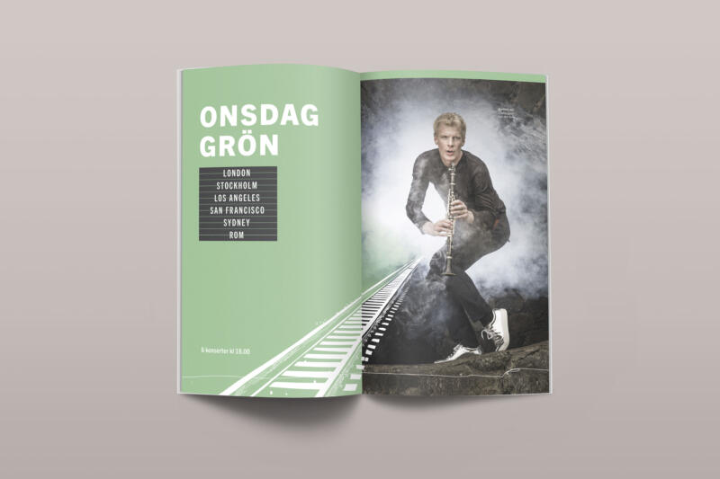
Green departure. The typography is reminiscent of the information boards in a departure hall
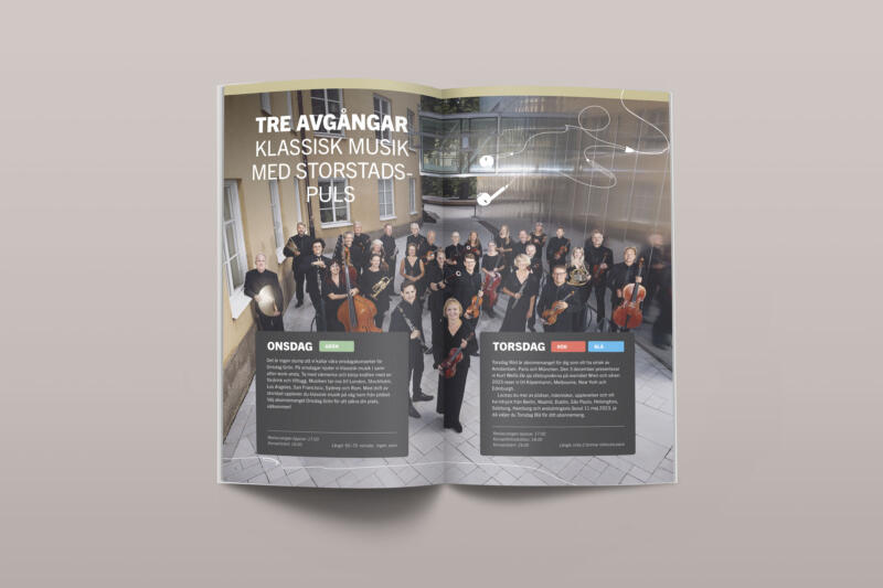
Presentation of the subscription packages. A pair of headphones find their way onto the spread, a typically nice thing to have with you when you travel and want to "switch off" a bit.

Green departure
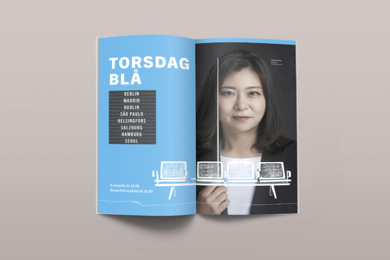
Blue departure

A detail in the program
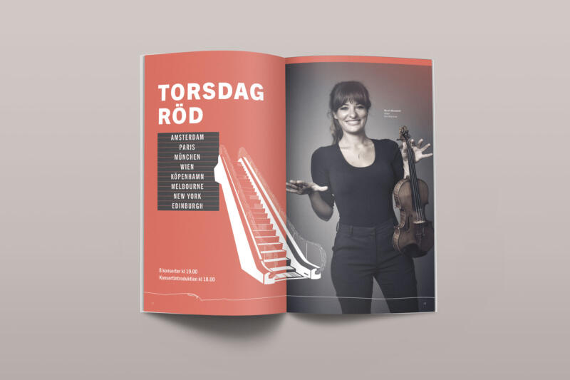
Red Departure
